Case Study: Comparison Page Mobile Design
Making mobile easy to understand and a delight to use when comparing products.
Technology
Jira & Figma
Timeline
8 weeks
Role
Designer & Strategist
Team
1 Designer
2 Developers
1 Project Manager
Creating a mobile version of the comparison page that is user-friendly.
I was the design lead at TrustRadius on this project and worked closely with engineering on possible solutions.
Problem
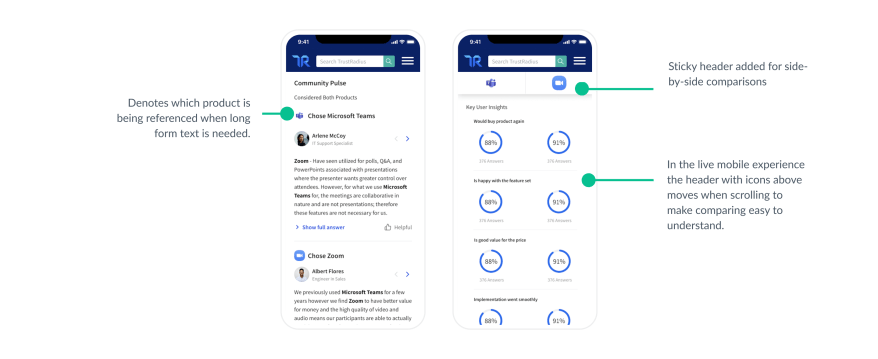
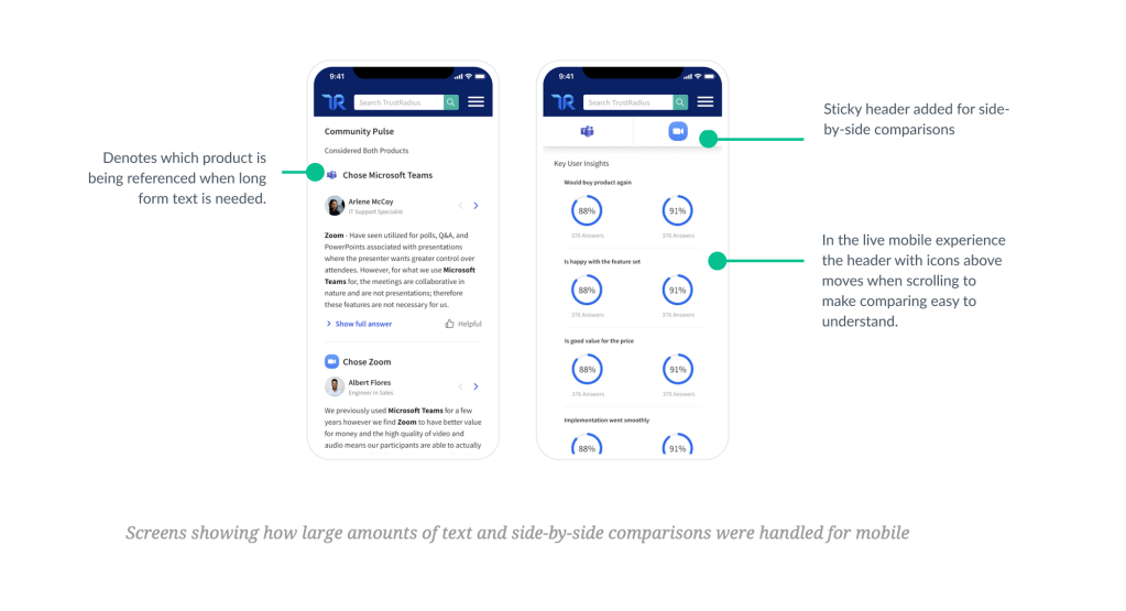
I needed a way to show comparisons in instances with large amounts of text and where there was little text. Side-by-side comparisons are easy to visualize, but large amounts of text are hard to read and compare when the screen collapses to a mobile size.
Solution
Creating a sticky header that would appear and disappear on areas on the comparison that work well side-by-side on mobile.
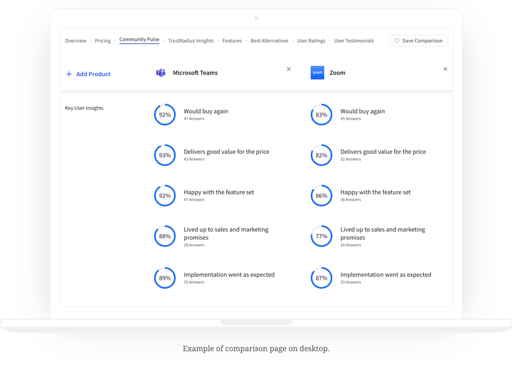
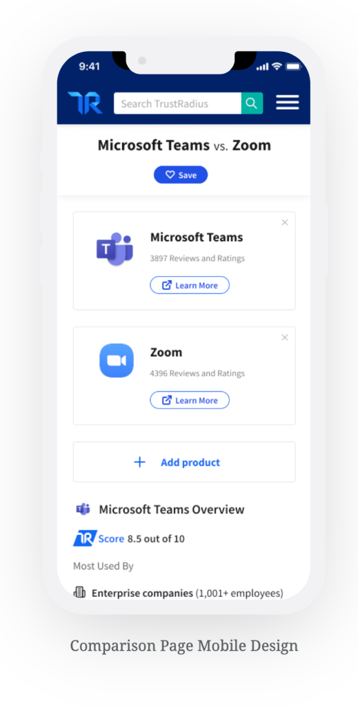
Mobile Design
Once the usability issues were resolved, I moved on to design the final screens in Figma. My goal was to create a design that made the comparison page a pleasant experience on mobile that is easy to understand.
Next steps
User testing the design to confirm some of the assumptions we had with the design and refining the experience.
Learnings
My favorite part of this project was pushing myself to solve a problem in the best way possible and to think outside the box. I also really enjoyed working with the engineer directly and seeing his excitement to work on something new and different as well.
 Mary Keith Trawick